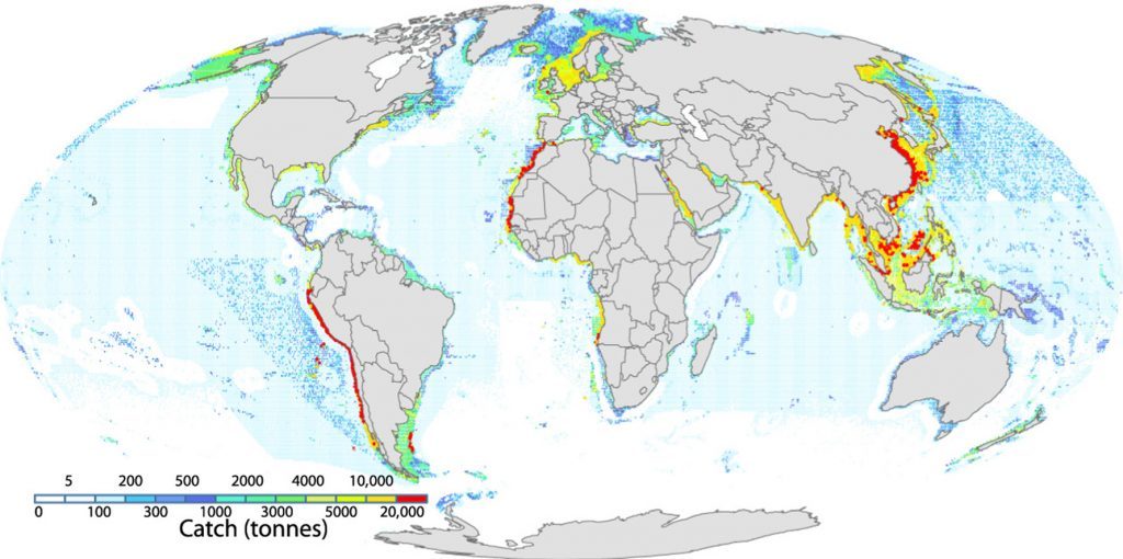
May 4 2018 — May 4, 2018 — In February, a paper published in Science Magazine mapped the “footprint” of fisheries, showing that fishing vessels are fishing in 55% of the world’s oceans. While some concluded that this study indicated immense overfishing, critics pointed out that the study did not show the intensity of fishing. However, a new paper in Marine Policy does show how much fish is caught and where. This new study is a true map of global fisheries.
The following is excerpted from an article published yesterday by Sustainable Fisheries UW:
A new paper out in Marine Policy ($) gorgeously illustrates global fisheries over the past 150 years. The figures tell the story and are cool as hell:
Where is fish caught?

Geographical representation of where fish is caught. Areas shaded by amount of catch in metric tons.
This is one of the coolest figures we’ve ever seen. You can see that areas with lower catch (like the high seas) correlate to areas with lower primary productivity—we go into further detail about primary productivity and fisheries here, in Seafood 101. A few weeks ago a different paper was published in Science that mapped the “footprint” of fisheries, essentially showing where fishing boats travel in the ocean. The paper was criticized for failing to show what the above figure shows clearly: how much fish is caught where. This is the true map of global fisheries.
Read the full story at Sustainable Fisheries UW
