January 19, 2014 — The Japanese earthquake and tsunami of March 2011 is still being discussed three years later, particularly in relation to the catastrophic meltdown of the Fukushima Daiichi nuclear power plant. Faced with a lack of available official information on Fukushima and its effects, millions have tried to educate themselves on the Internet. People's Facebook feeds are suddenly awash with alarming news and confusing YouTube videos. Some have even sworn off seafood. Almost three years after the meltdown, there has been a recent tidal wave of Fukushima stories – some true, some half-true and some outright falsehoods. Stories of men with Geiger counters strolling radioactive beaches in California, fearful warnings from respected public figures and toxic fish tales are spreading around the globe like plumes of radiation on the currents of social media. Are you freaked out by Fukushima? Are you not sure what to think? Neither were we, so we went to the people who should know, to separate the science from the science section.
1.THE MAP OF DOOM
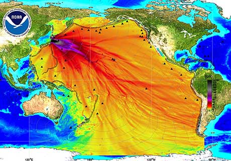
You may have seen this arresting image online. You may have even shared it on Facebook.

This map, supposedly showing radiation spreading across the ocean from Japan, was one of the most widespread pieces of Fukushima (mis) information — it was also one of the easiest myths to debunk. We just went to the source.
The map was produced by the U.S. government's National Oceanic and Atmospheric Association, and spokeswoman Keeley Belva confirmed the map doesn't show the spread of radiation.
According to their website: "This image was created by NOAA's Center for Tsunami Research and graphically shows maximum wave heights of the tsunami generated by the Japan earthquake on March 11, 2011.
"It does not represent levels of radiation from the damaged Fukushima nuclear power plant." The map has become "an oceanographer's in-joke," according to Robin Brown, manager of ocean sciences for Canada's Department of Fisheries and Oceans. Two months ago, Brown gave a seminar to 40 oceanographers and showed a slide of the infamous NOAA map with the headline, "West Coast Fried by Radiation." The room burst out laughing, Brown said, but their chuckles were "tinged with a bit of sadness."
"I felt so sorry for NOAA," he said. "It's a bit of a cautionary tale about how your good work could possibly show up in a place you didn't expect."
The bottom line: Yes, it's a real map, but it doesn't show radiation.
Read the full story at watch the video at The Province
